- Brand strategy
- Visual identity
- Pitch deck
- Website design
- Website development
- Photography direction
- Copywriting
Armor Bands
An ostomy isn’t the end. It’s a beginning.
Overview
Armor Bands is a direct-to-consumer ostomy band company founded by AC Stinson, an ostomy patient himself, and built as a family business. The product provides stability, prevents leakage, and lets people return to an active life, and to the everyday moments that an ostomy quietly takes away. It’s engineered for a younger demographic at a moment when the patient population is itself getting younger.
Challenge
The category sells management. Armor Bands sells reclamation. Competitors mostly speak to patients in their 50s through 70s and treating the product like medical equipment. AC had identified a real gap – the 20-to-40 age range that the rest of the market wasn’t even trying to reach.
But the brand was working against the opportunity. A high-vis orange and green palette read outdoor and active rather than premium. A pitch deck that talked about the product but almost never showed it. Visual proportions and color usage that pulled the system toward fitness accessory when the ambition was performance lifestyle. For a category where credibility matters as much in the surgeon’s office as it does in the customer’s cart, the brand needed to grow into the ambition behind it.
Define
Armor Bands needed to speak credibly to surgeons and clinicians who could become referral partners, and directly to the patients who would find the product through them or on their own. Those rooms have different concerns, but the brand had to feel unmistakably the same in both.
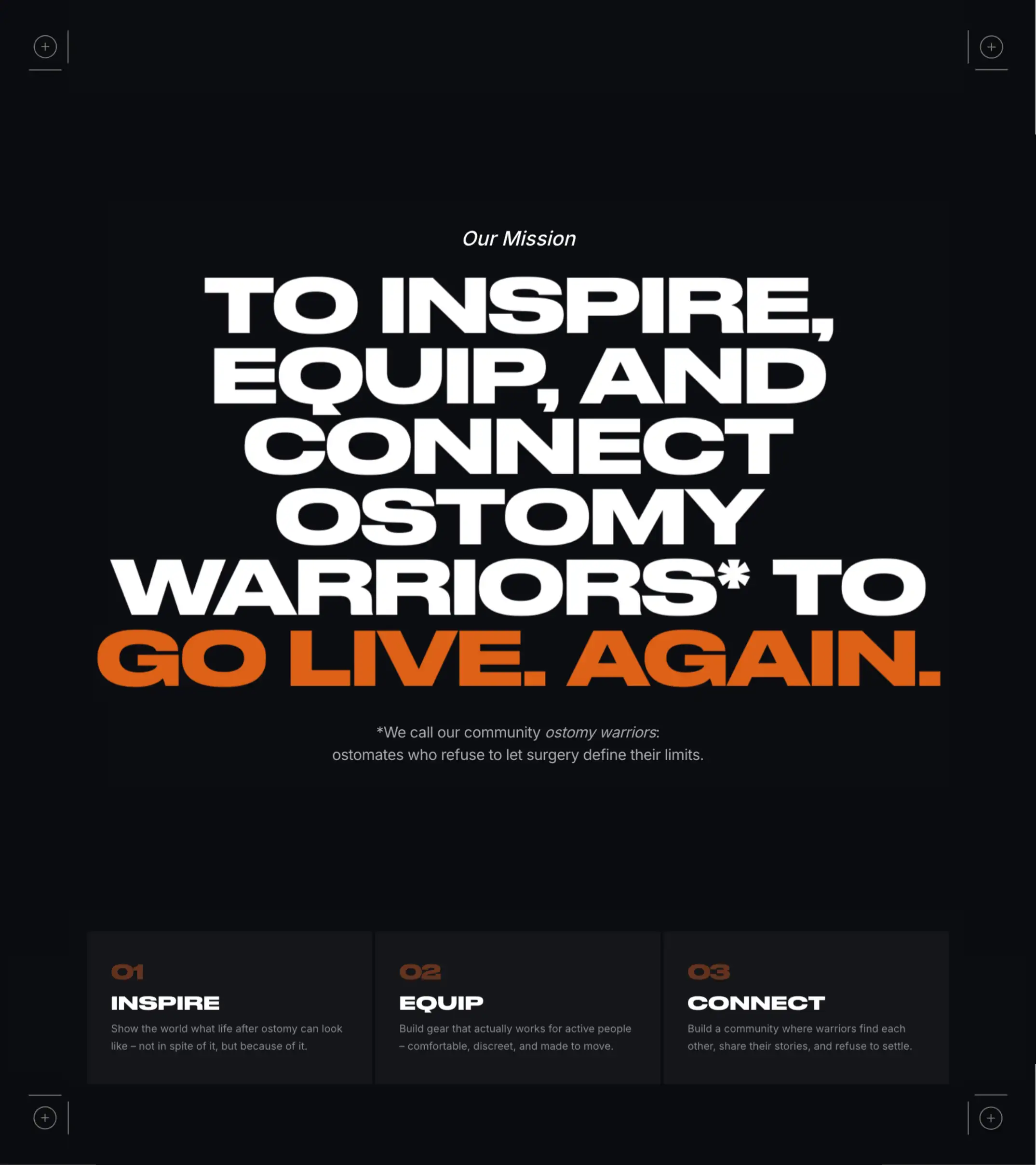
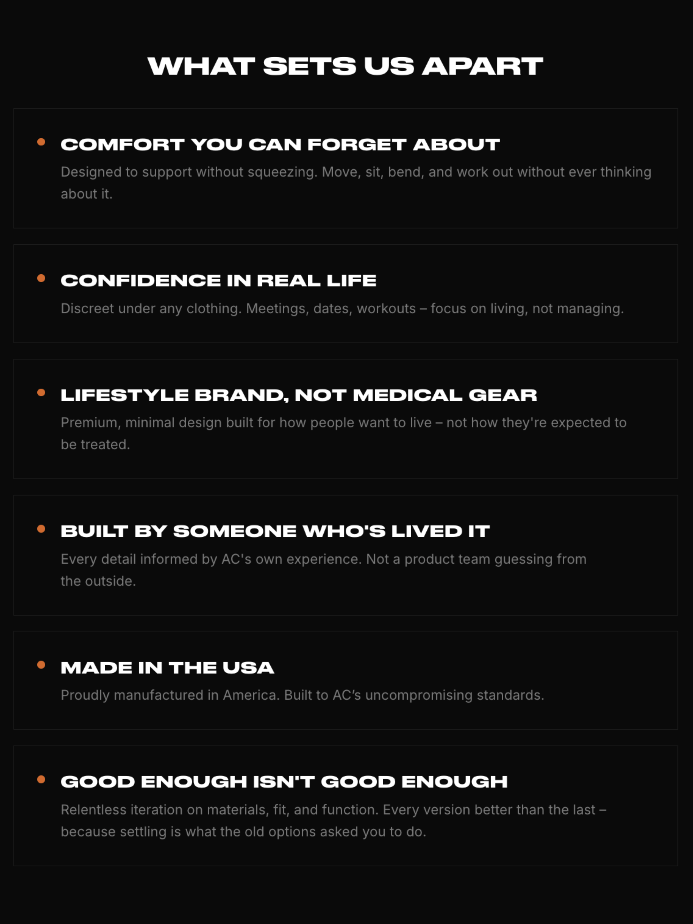
The positioning we landed on: the performance lifestyle brand of ostomy care. Premium quality, broad appeal, mission at the center. Not a medical device dressed in athletic clothing. A lifestyle brand that happens to be built around a real clinical need.
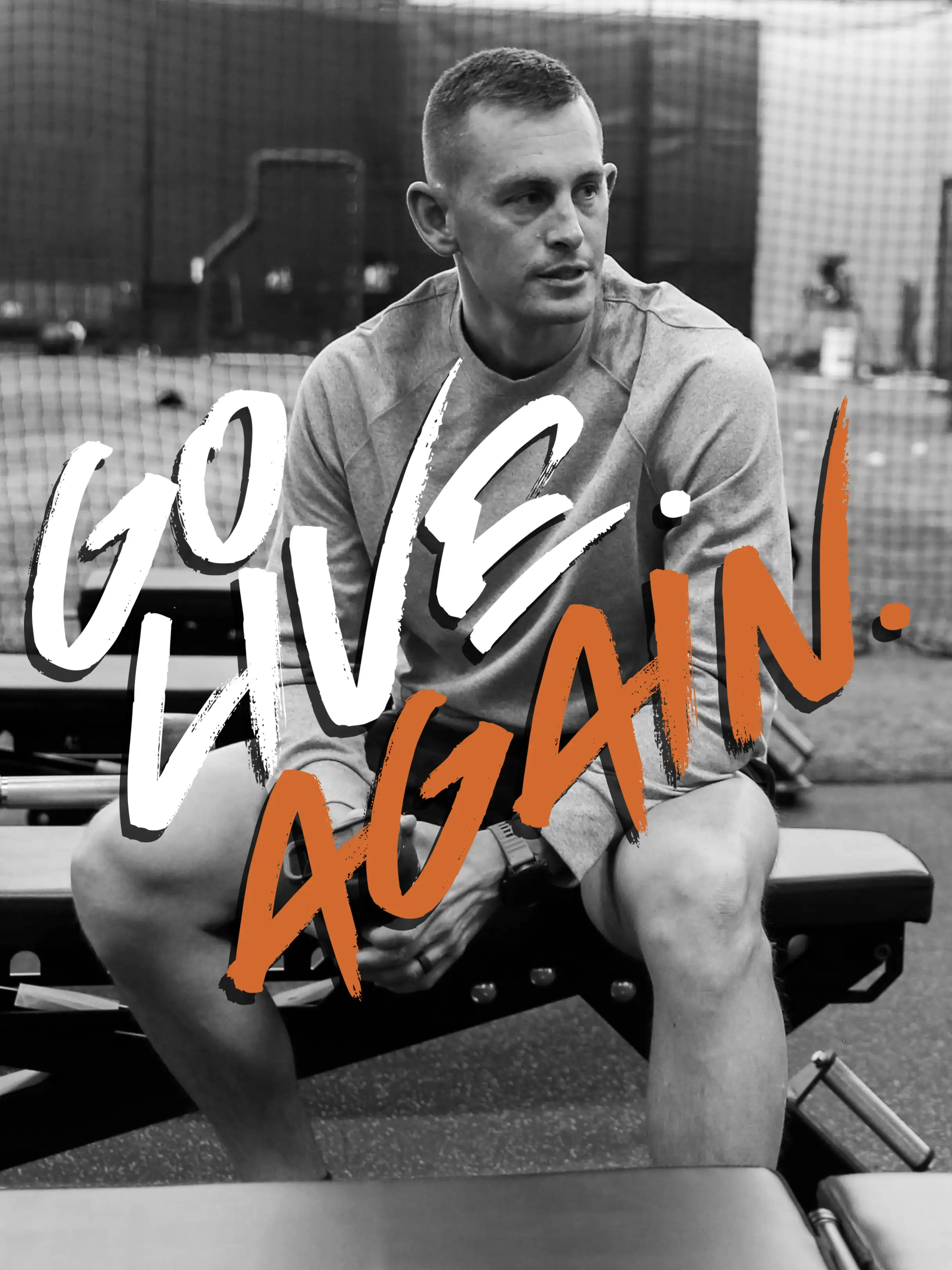
The core insight came from AC’s own experience: he forgot he was wearing the Armor Bands prototype, while the leading competitor felt like wearing a corset. The brand had to feel the same way the product does. Present when you want it, invisible when you don’t.
Identity
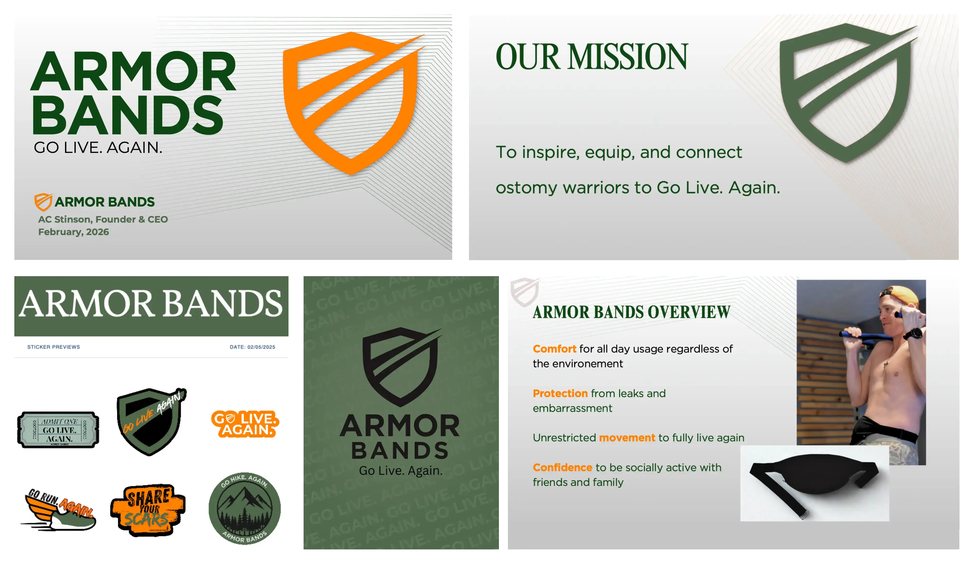
We didn’t tear down what was already there. We sharpened it. The bones of AC’s vision – the warrior mindset, the inspirational community, the “GO LIVE. AGAIN.” promise – were the strongest assets in the room. Our job was to give them a setting that matched.
The Mark
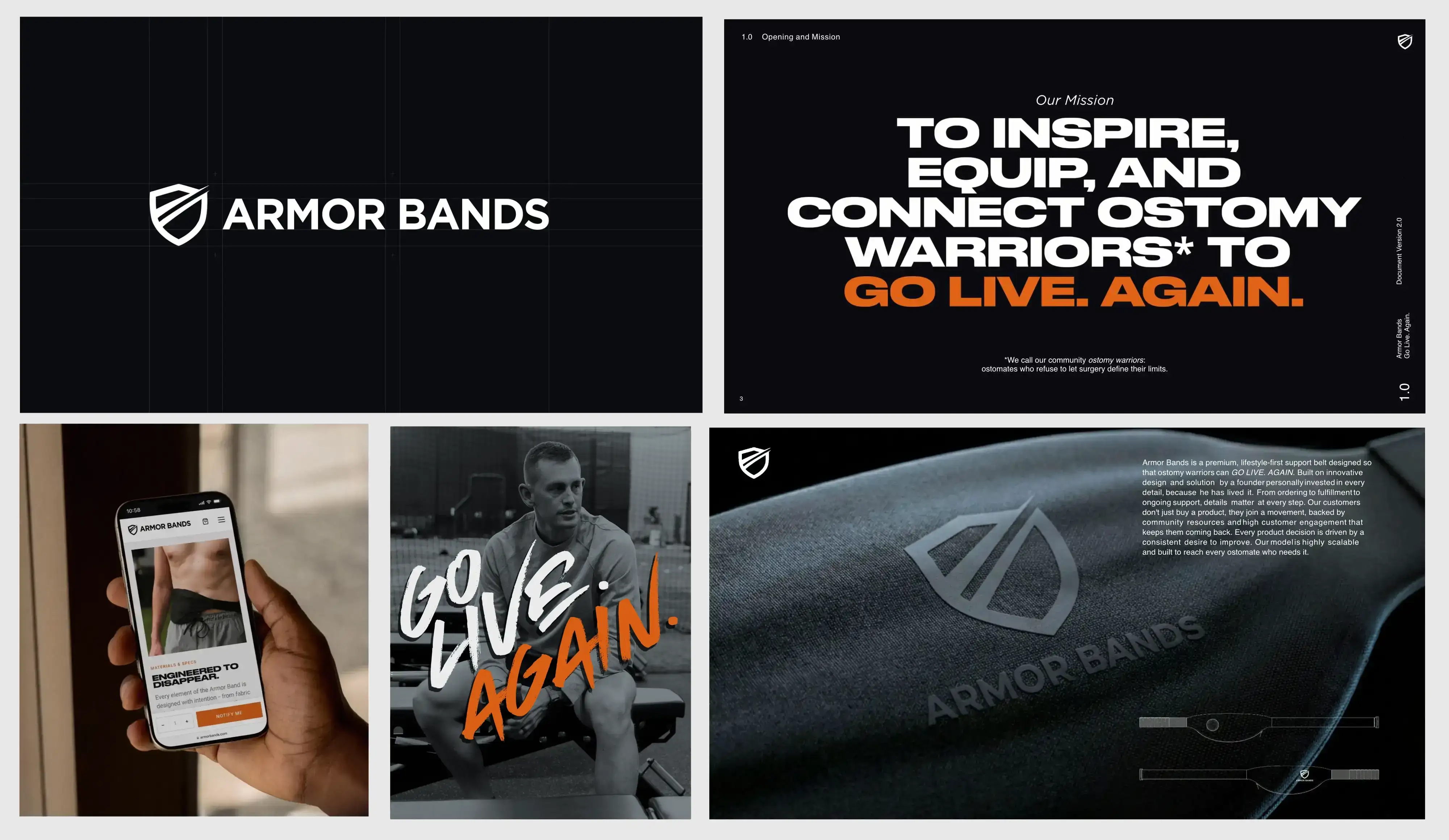
The shield was already there, and it was already right. Our job wasn’t to redesign it, it was to give it the technical foundation a real brand needs. We vectorized the existing mark, preserving the warrior energy AC had built into it from day one, and let the rest of the system rise to meet it. Sometimes the best identity work is knowing what not to touch.

Typography
A typographic hierarchy designed to separate the brand from the logomark without competing with it. Serious where it needs to be, athletic where it should be. The result reads closer to a performance brand than a medical one.
Color
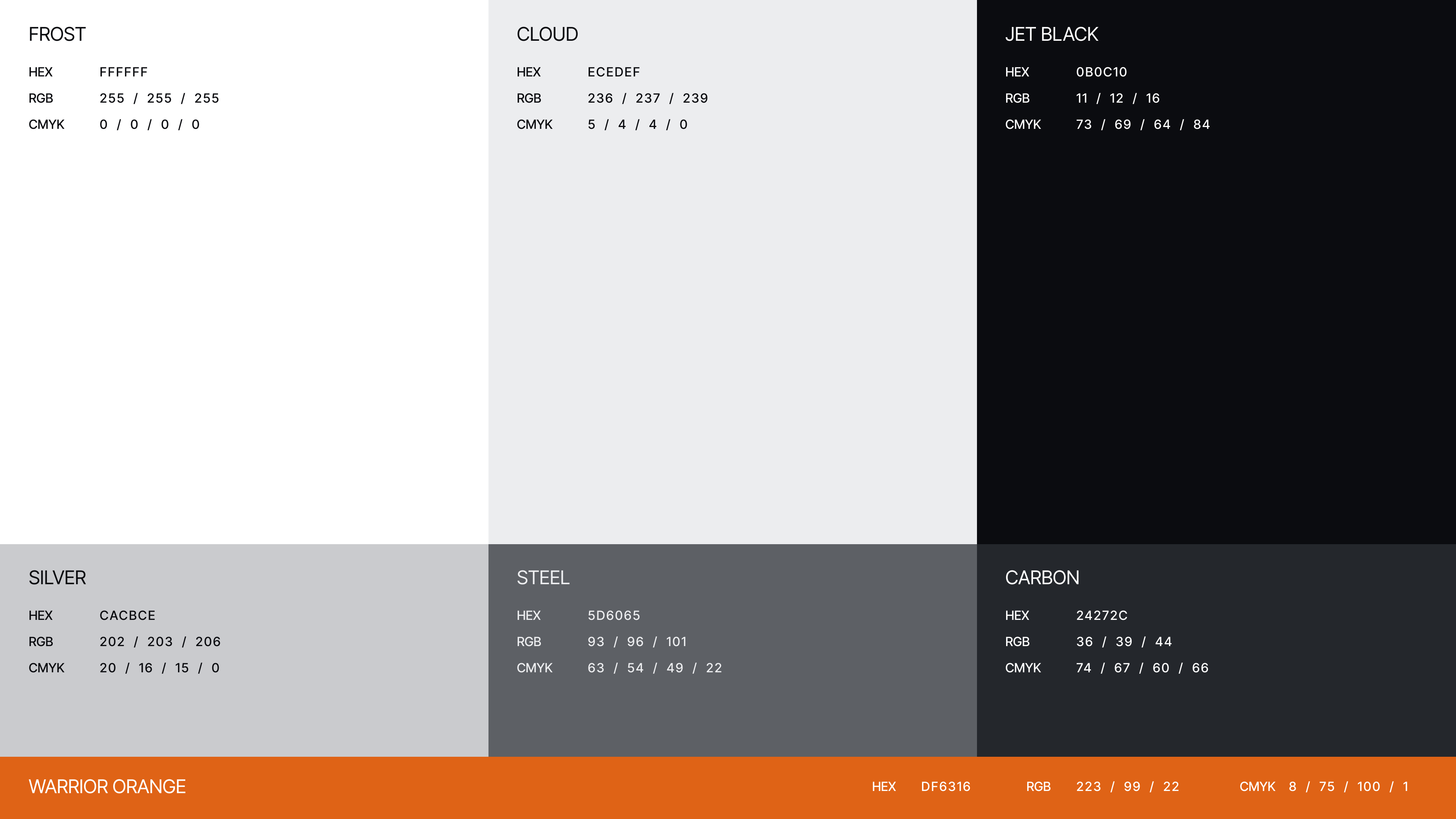
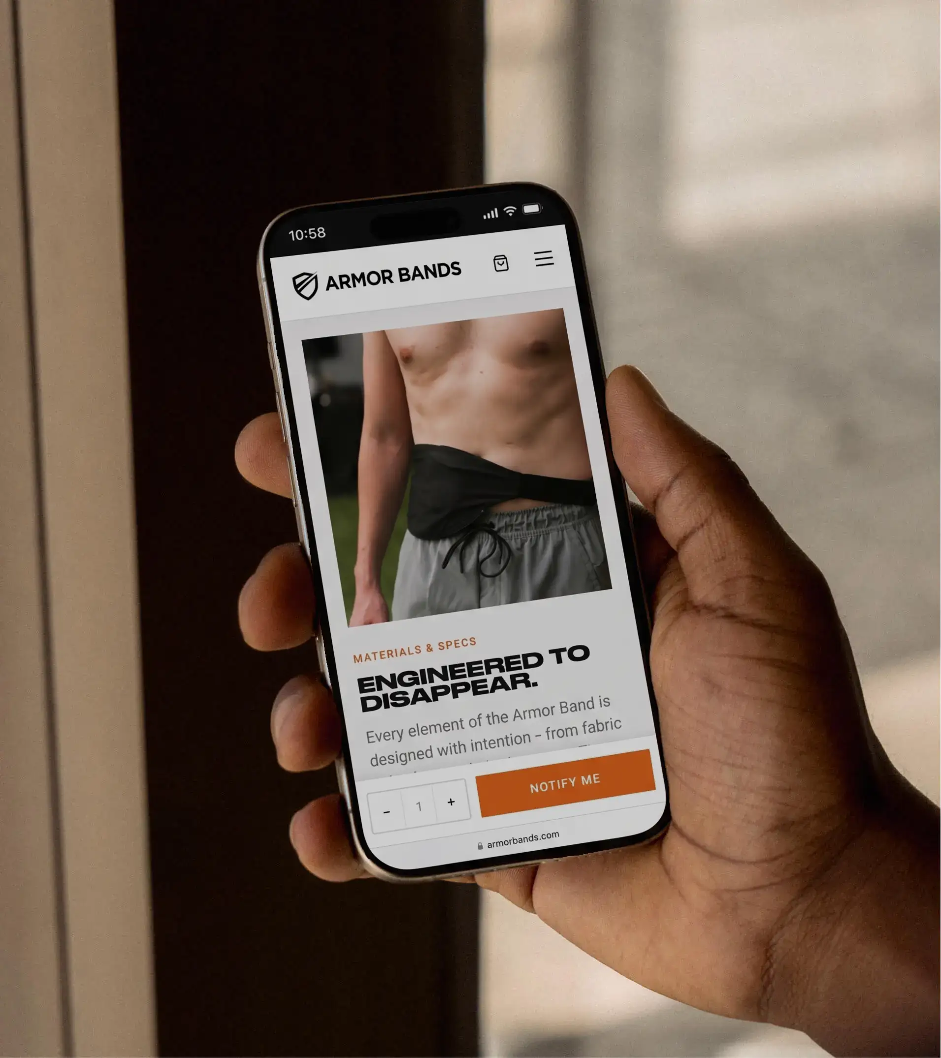
We moved decisively away from the original green-heavy palette to a black-and-white foundation with a single, deliberate orange accent. A more web-safe, print-friendly orange that retains the warrior energy without overwhelming the system. Black grounds the brand in seriousness. White creates the space the product photography needs. Orange does one job, and it does it loudly: this is a brand that wants you to act.
Voice
The “GO LIVE. AGAIN.” tagline does more work than most taglines ever do. It’s aspirational, active, emotionally charged, and it reframes the entire category from managing a condition to reclaiming a life. We extended that voice across the deck and the site: first-person throughout, because AC is the brand and AC is the one pitching it. Six brand values anchor the system, including the one that captures the whole philosophy in five words: “good enough isn’t good enough.”
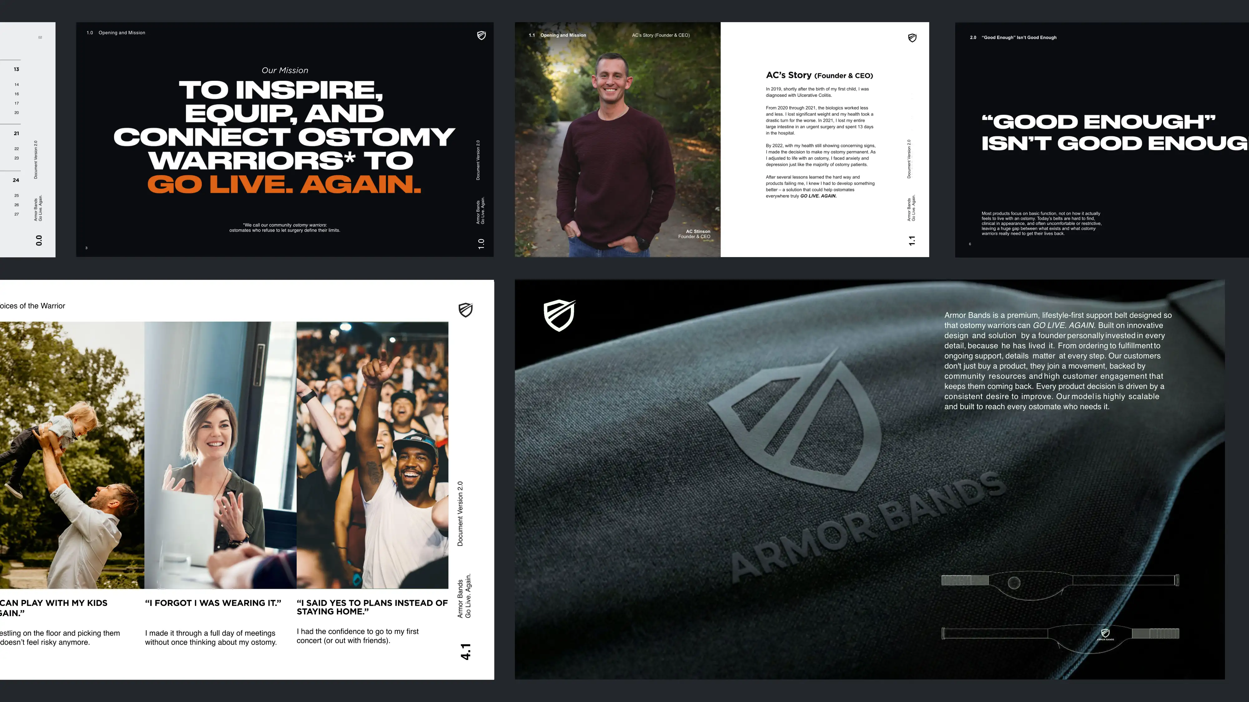
Pitch Deck
Built for two rooms. A consolidated narrative that opens with the founder story and the market opportunity, then routes into audience-specific call-to-action slides. One for clinicians considering a partnership, one for business partners and prospective investors. A visual growth slide carries the customer through design, production, community, and a co-branded delivery moment that lets future partners see themselves in the journey. Both digital and printed versions were prepared.
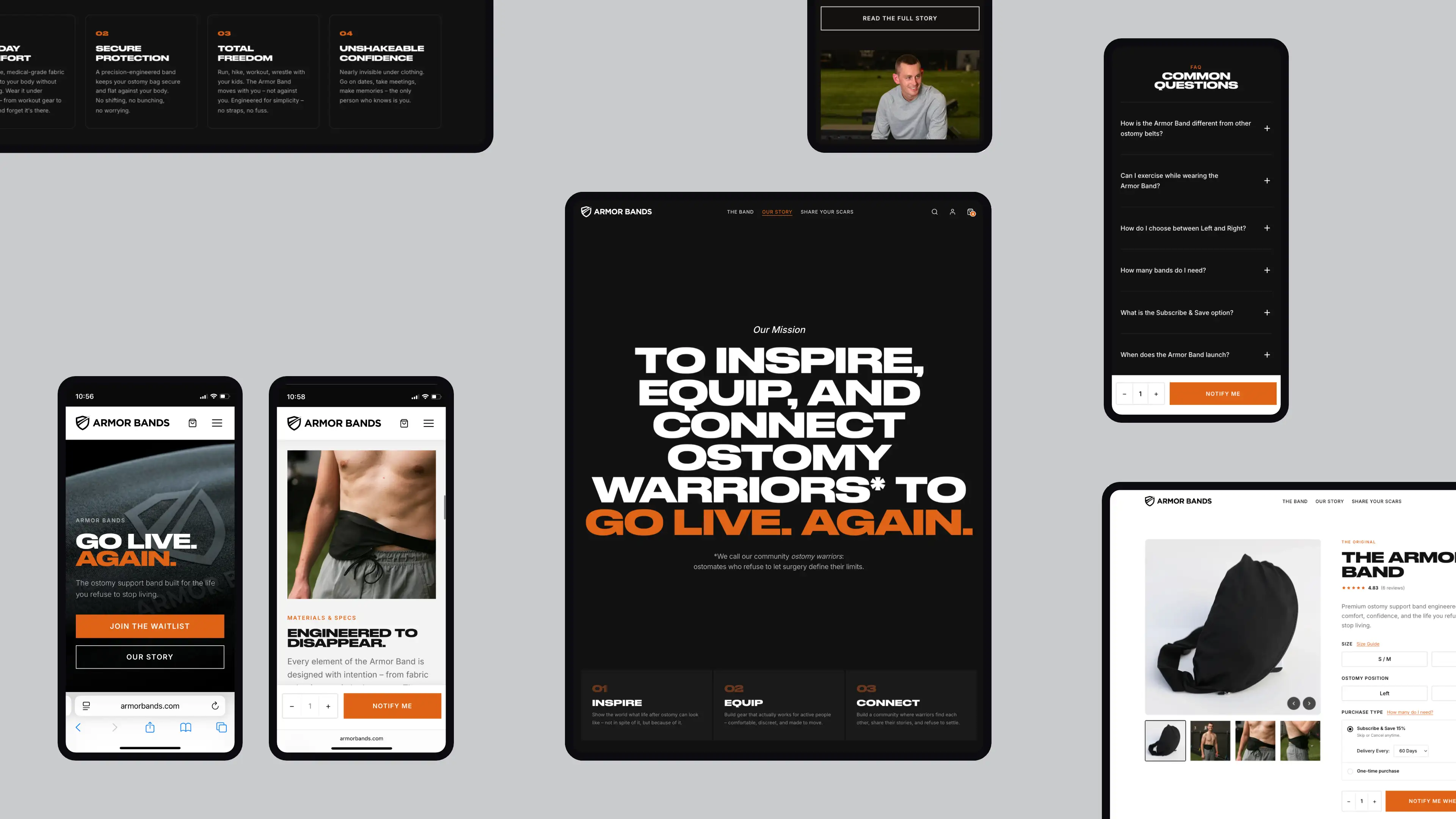
Website
Built on Shopify so the family can run it themselves. A theme architected so AC can edit copy, swap photos, adjust colors, update menus, and manage the announcement bar without a developer in the loop.
The About page leads boldly with the mission statement, followed by the inspire/equip/connect framework, then the founder story. The emotional hook, “There has to be something better”, is the entire brand in six words.
Results
Following the rebrand, the first surgeon meeting at Ohio State ran 90 minutes against a 60-minute agenda. The deck landed, the color pivot was validated unprompted, and the surgeon offered prime lobby placement for brand materials.
A brand that started as a family idea now looks and reads like the company it’s about to become.
Armor Bands launches in summer 2026.
It feels like you’re on Nike, or Lululemon. Those are kind of our inspiration, but it feels very legit. It does not feel like a small business website.
My initial reaction is, holy cow, this is fantastic. The subtle changes you made … I appreciate the thought, but I also appreciate the education – putting it side by side so we understand the reasoning behind it.
I’ve said it several times – I can’t believe we have a website this good.
Credits
To our friends at Armor Bands:
A new venture takes bravery and true collaboration. You brought it all to the table. Thank you Austin, Kasey, Larry, and Vickie.
Strategy, Creative Direction, Design, and Development
- Matt Bacon
Pre-existing Brand Assets
- Kasey Stinson
Photography
- Tricia Jean Photography
Typefaces
- Druk Wide Bold – Commercial Type
- Inter – Rasmus Andersson