- Visual Identity
- Website Design
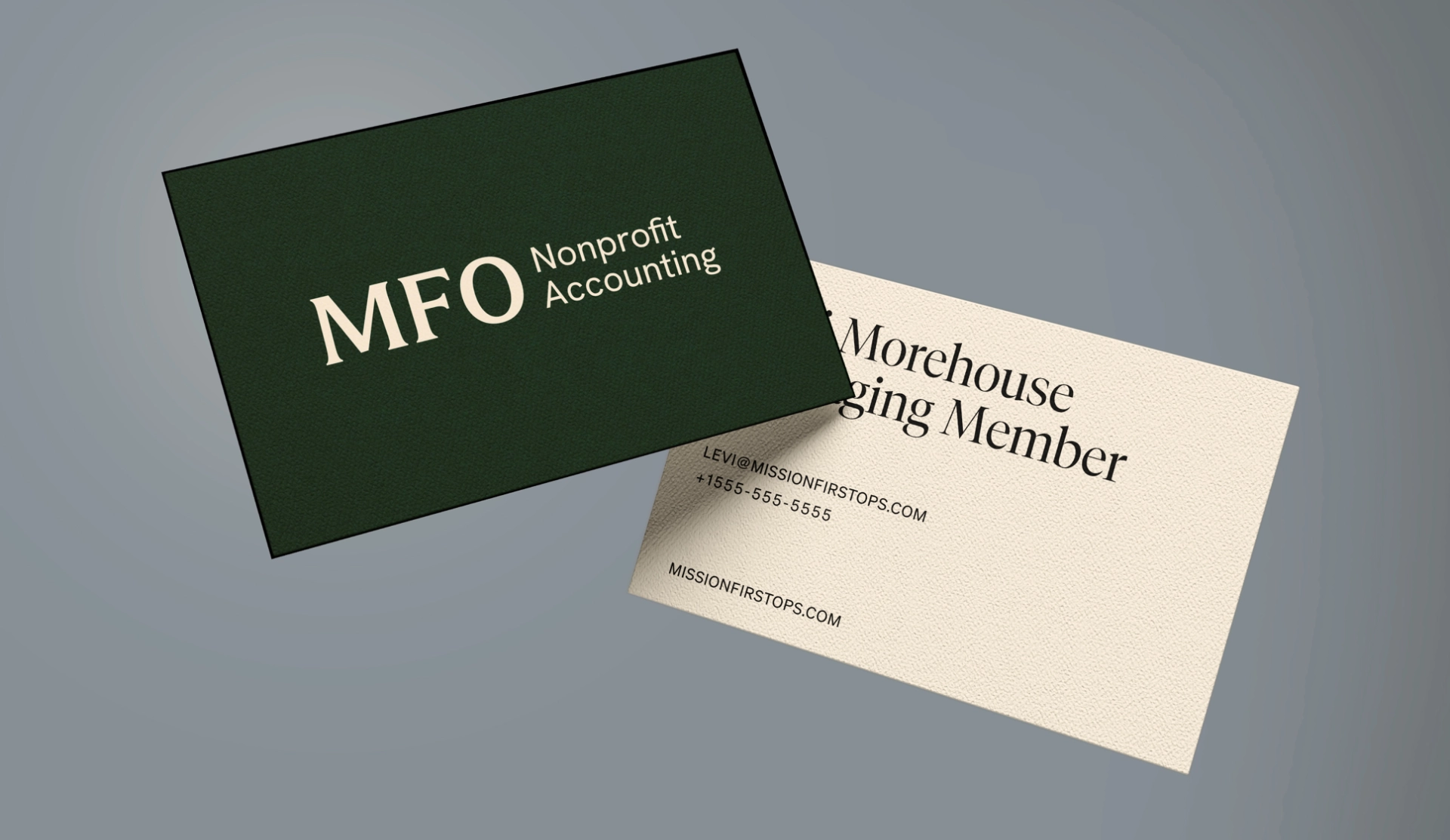
MFO Nonprofit Accounting
MFO had the reputation. Now they have the brand to match.
Overview
Mission First Operations (MFO) is a cloud accounting firm dedicated exclusively to nonprofits. Over the years, MFO has grown rapidly on the strength of relationships alone. Their clients include DC think tanks, billionaire-funded biotech research organizations, and nonprofits shaping policy at the highest levels.
MFO had built a reputation that their clients genuinely valued. Reliable, proactive, deeply specialized. The kind of partner that treats compliance as a relationship, not a series of tasks.
But the brand told a different story. A patriotic color scheme. A name that still referenced broader operations after the firm had focused down to accounting. A logo that felt more like a space agency than a financial partner. And a website that hadn’t kept pace with any of it. For a company serving organizations with eight-figure budgets and boardroom scrutiny, the gap between the quality of the work and the quality of the brand had become a liability.
MFO didn’t need a louder brand. They needed one that matched the caliber of what they’d already built.
Define
MFO grows through referrals, so the website’s job is to confirm what prospects have already heard.
The core insight: those prospects aren’t looking for a “rebellious” or overly-friendly accountant. They want someone exceptional at the fundamentals who is also easy to work with.
“If we say we're your best friend and we do accounting, that's scary. If we say we're great at accounting and happen to be friendly—that's trust.”
— Levi, MFO Managing Member
Identity
We created an identity that roots MFO in the tradition of accounting while presenting it through a modern lens.
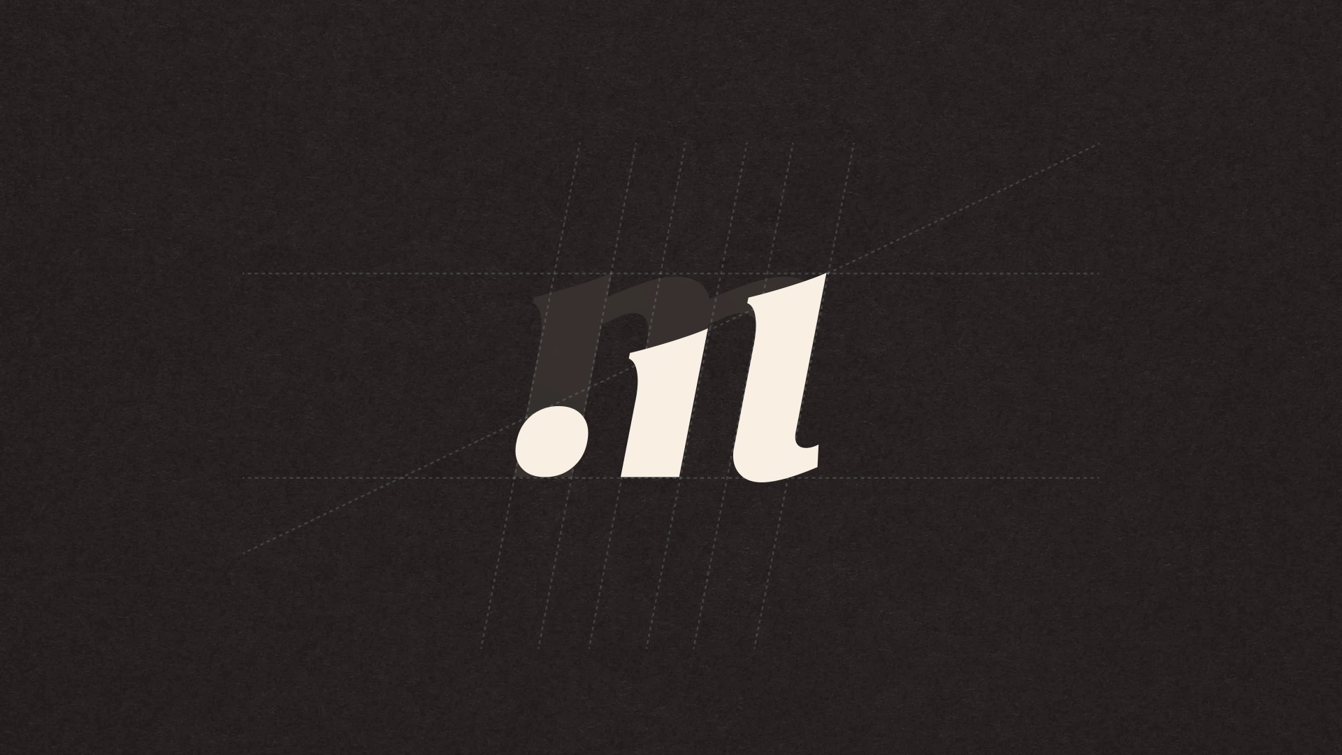
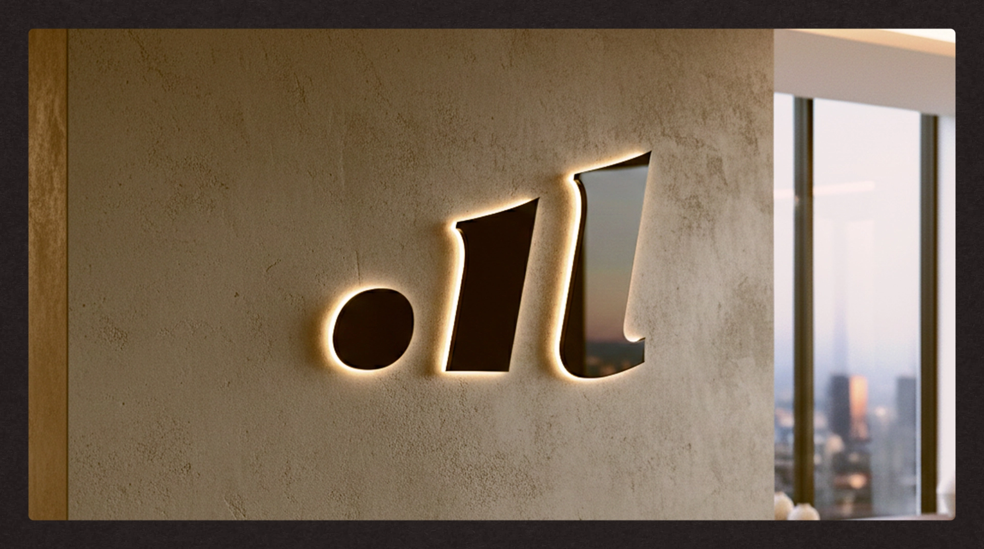
The Monogram
The logomark begins with a serif M. It’s dissected diagonally, revealing an upward trend bar chart within the letterform. It’s a nod to the reporting and growth that MFO delivers for its clients.
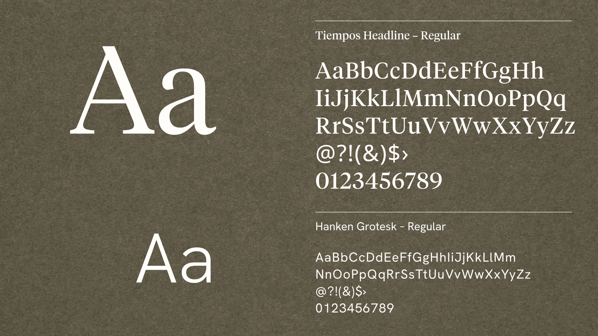
Typography
A sharp, modern serif leads the headlines. Paired with a clean sans-serif for body copy, the combination strikes the balance the brand demands: serious subject matter, approachable delivery.
Color & Texture
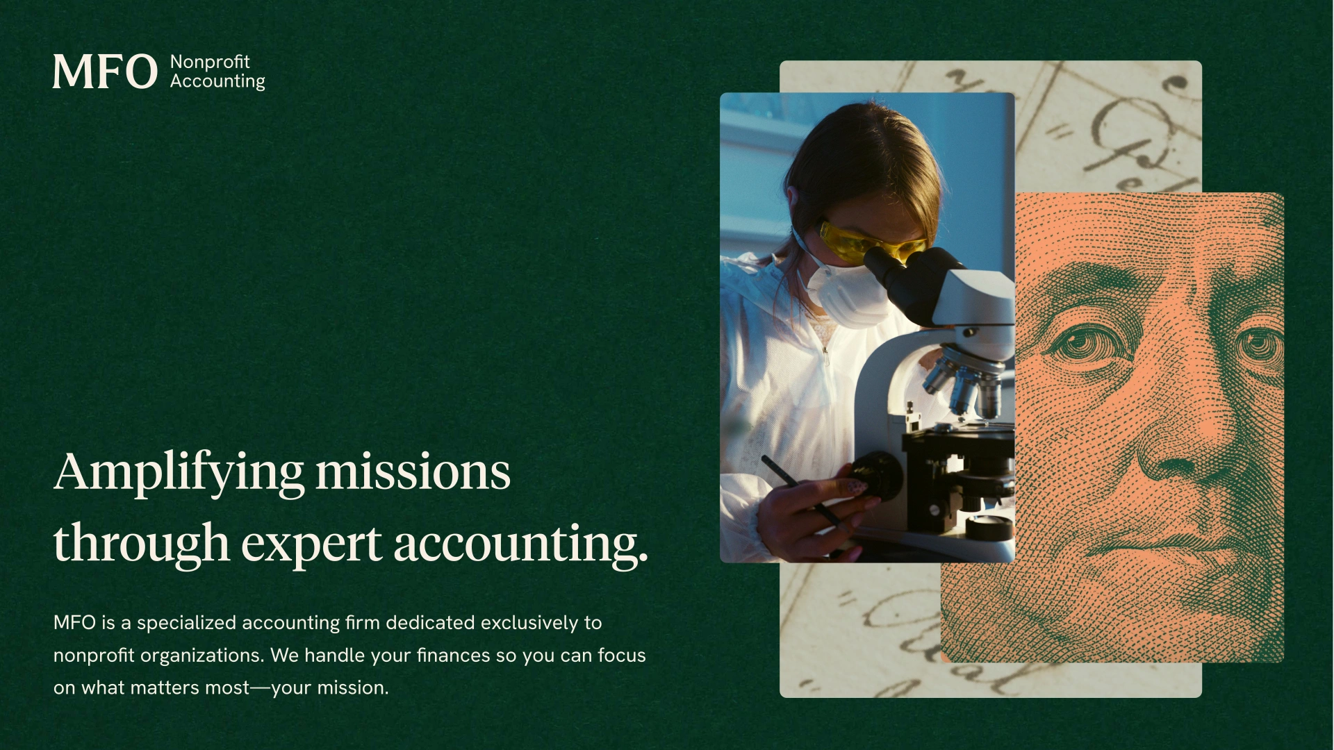
The palette moves decisively away from the previous patriotic scheme, with deep, earthy greens and warm browns. Textured paper backgrounds run throughout the system, evoking the ledger books and ruled pages of traditional accounting.
Photography
We traded generic nonprofit clichés (smiling children, clasped hands, etc.) for a system built on specificity. The visual library is curated to reflect MFO’s actual clients: biotech and scientific research, the American landscapes where their nonprofits operate, and DC’s policy corridors.

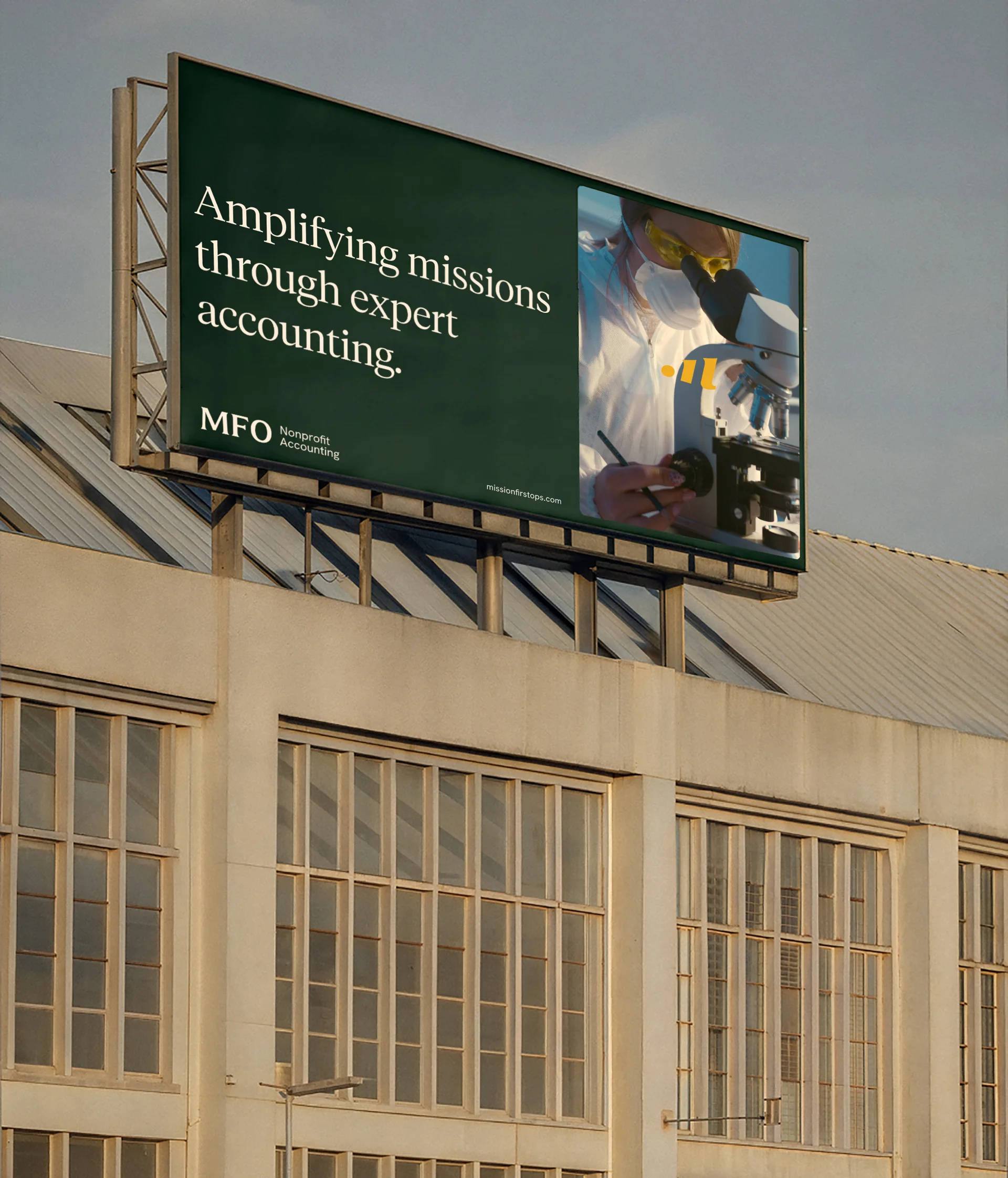
Website
The website brings the identity system together in a scalable, grid-based layout that subtly echoes the ruled lines of a ledger, while staying accessible and easy to use for every prospect who lands there.
Working with Matt on our rebrand was a great fit. I was impressed by how quickly everything moved. He grasped our vision early and gave us the creative direction we needed to reflect our vision and values better than ever.
Credits
A huge thanks to Levi, Denise, Matt, and the whole MFO team for their partnership and collaboration.
Strategy
- Matt Bacon
Design
- Matt Bacon
Typefaces
- Tiempos Headline – Klim Type Foundry
- Hanken Grotesk – Hanken Design Co.